NYC Taxi Trends on Valentine’s Day
My final project for my Data Science class at Columbia involved analyzing taxi data on Valentine’s Day in 2019. Our data was sourced from the NYC Taxi and Limousine Commission and included data on yellow and green cabs, Ubers, and Lyfts.
We thought that Valentine’s Day would be an interesting day to analyze, since people are likely to have plans at night, and they are likely to use taxis rather than the subway. We wanted to use the data to see if we could observe any trends in terms of pickup or dropoff neighborhoods, congestion, and the busiest times of the day. Some sample visualizations can be found at the bottom of this page.
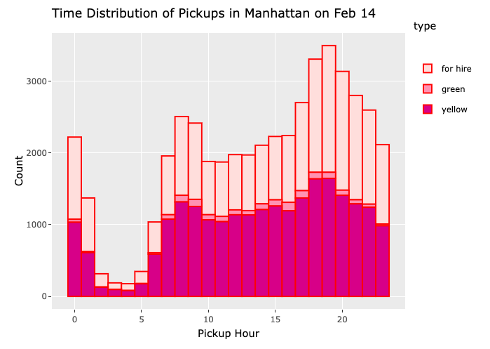
I was involved with creating time distribution graphs and an interactive map of the different taxi zones. Below is an image of a time distribution graph, which shows all taxi rides within Manhattan throughout the day, highlighting busy times.
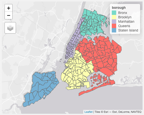
Another aspect of our project involved translating taxi zone codes to actual neighborhoods. In order to visualize where each neighborhood is, I created an interactive map that contained each zone and its corresponding neighborhood name and borough. The interactive version can be found here, but a screenshot is provided below.
More visualizations can be found on the website we created for our final project.